Trend Radar
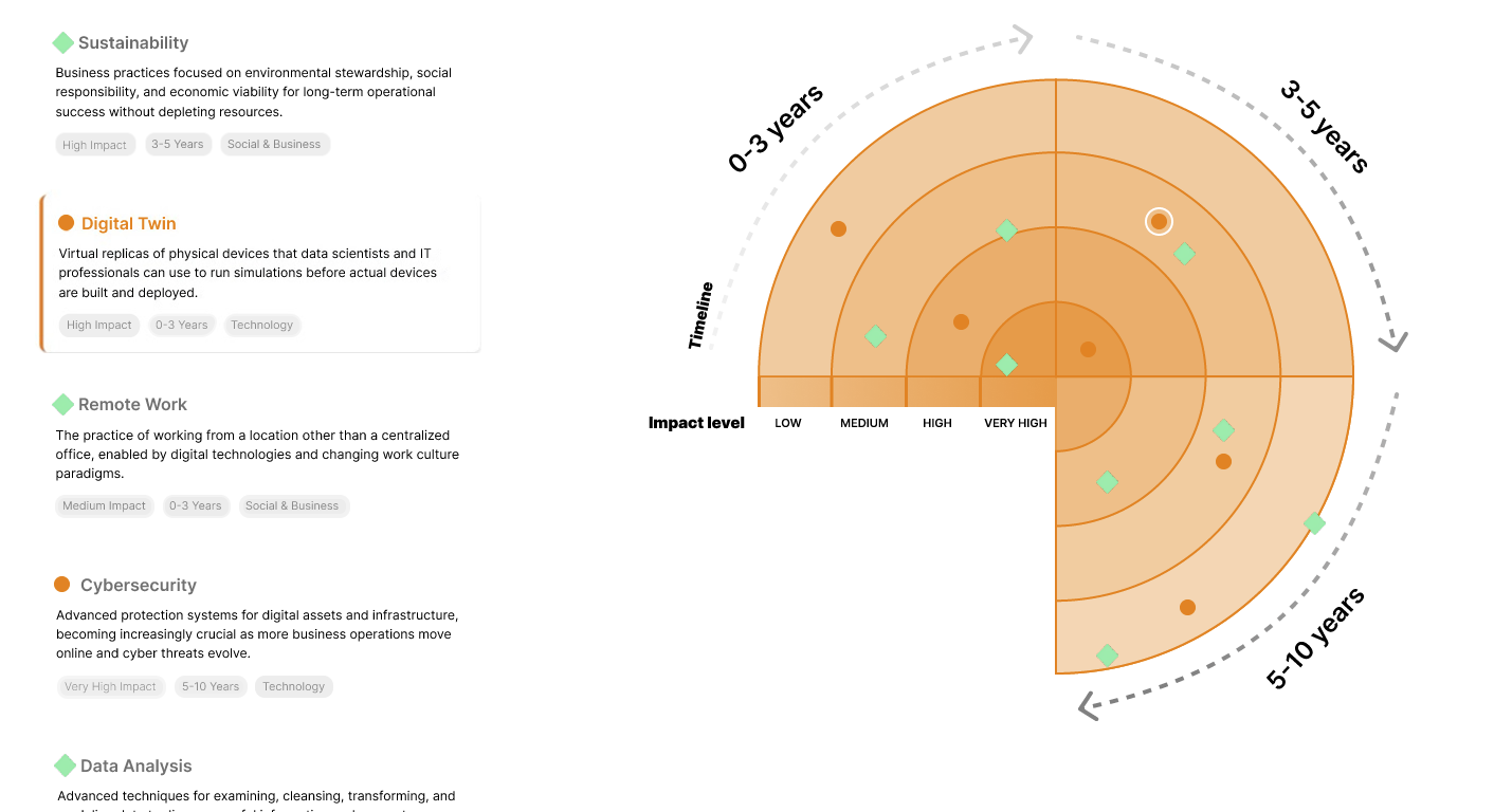
The Trend Radar is a dynamic data-driven visualization built for Vanderlande to help stakeholders explore technological and market trends over different time horizons (0–3, 3–5, and 5–10 years).
It was a university group project developed in collaboration with Vanderlande
Concept Development & User Testing
The first phase of the project focused on research. We examined several existing trend radars, including those developed by KPMG and Rijksinspectie Digitale Infrastructuur, to understand how information structure influences perception. Through this analysis, we realized that timelines must feel intuitive — progressing logically from near-term to long-term — and that readability should always take precedence over dense textual explanations.
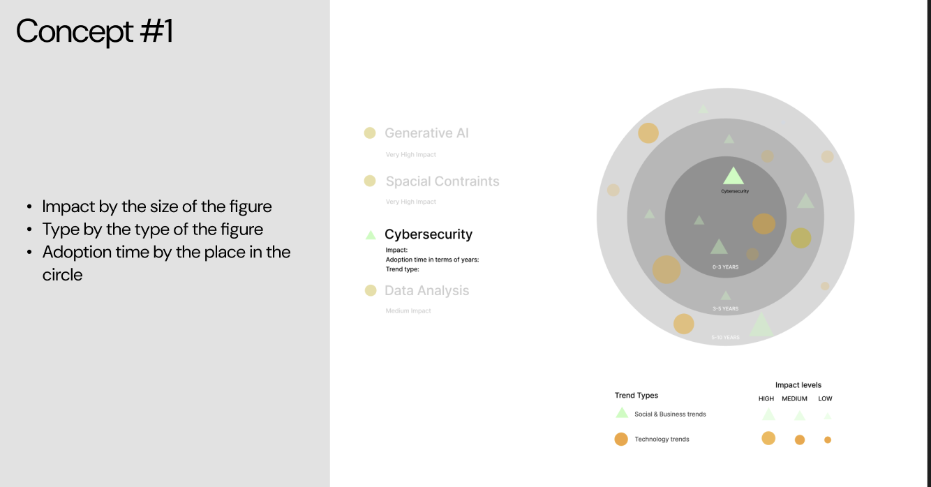
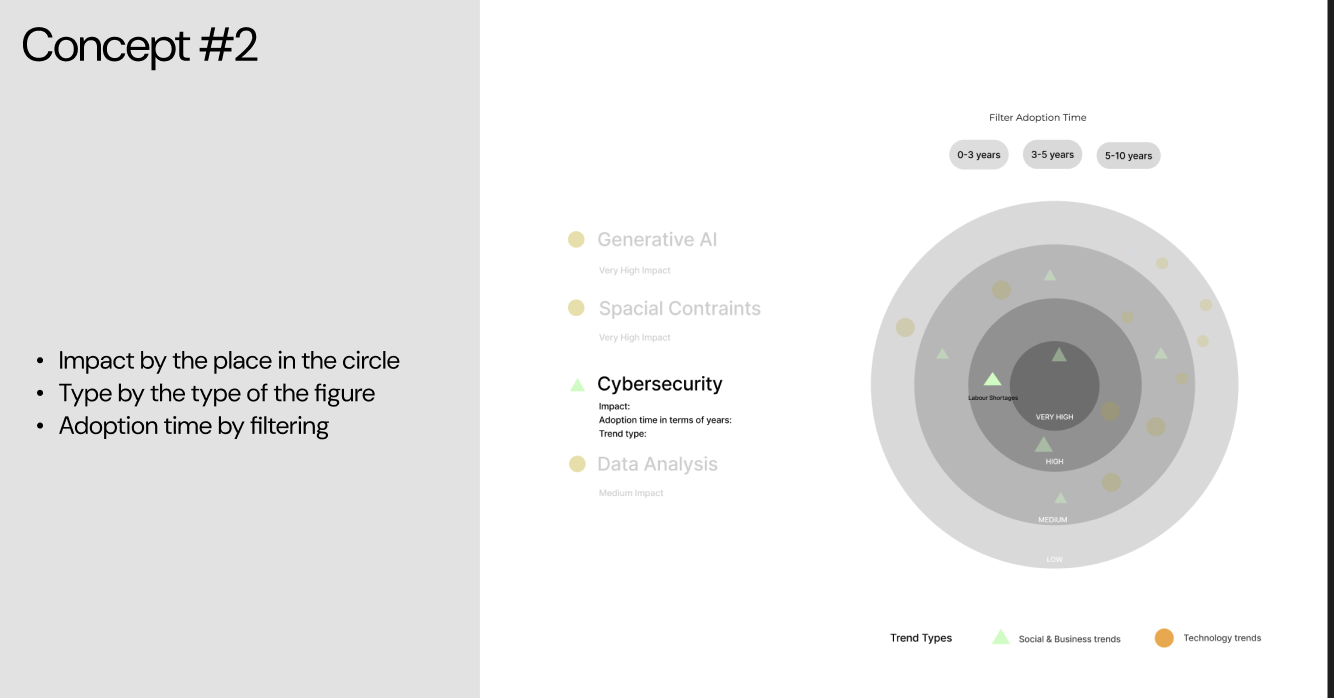
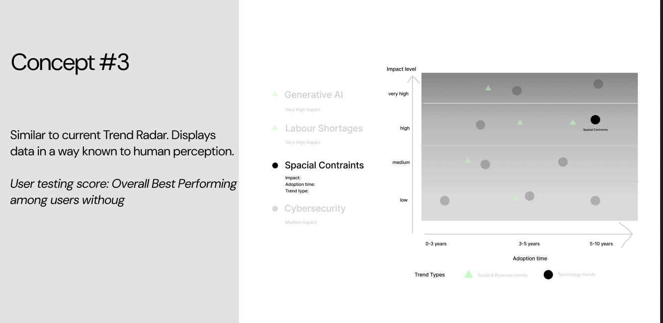
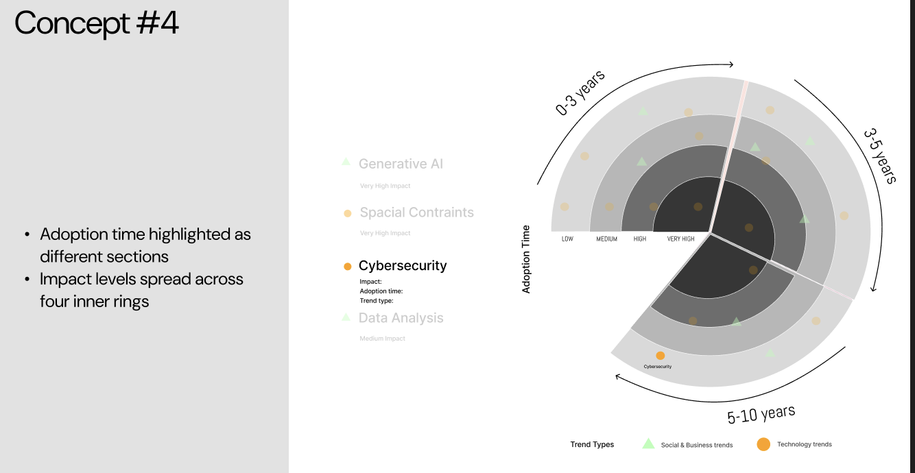
We then designed four mockups exploring different combinations of layout, information density, and interactivity. These prototypes were tested with two user groups: one consisting of people unfamiliar with trend radars, and another of participants who already understood the concept. The first group found Concept #3 easiest to understand initially due to its clear structure and strong visual anchors. However, once they grasped the logic, they noted that Concept #4 felt more informative. Meanwhile, the second group — those already familiar with trend radars — consistently preferred Concept #4.
The user testing sessions were crucial in guiding our design decisions. Based on our observations, participants familiar with trend radars were naturally drawn to Concept #4, so we selected it as our final direction since it best aligned with our target audience: professionals already using trend radars to explore information.
Develop
Radar Iterations
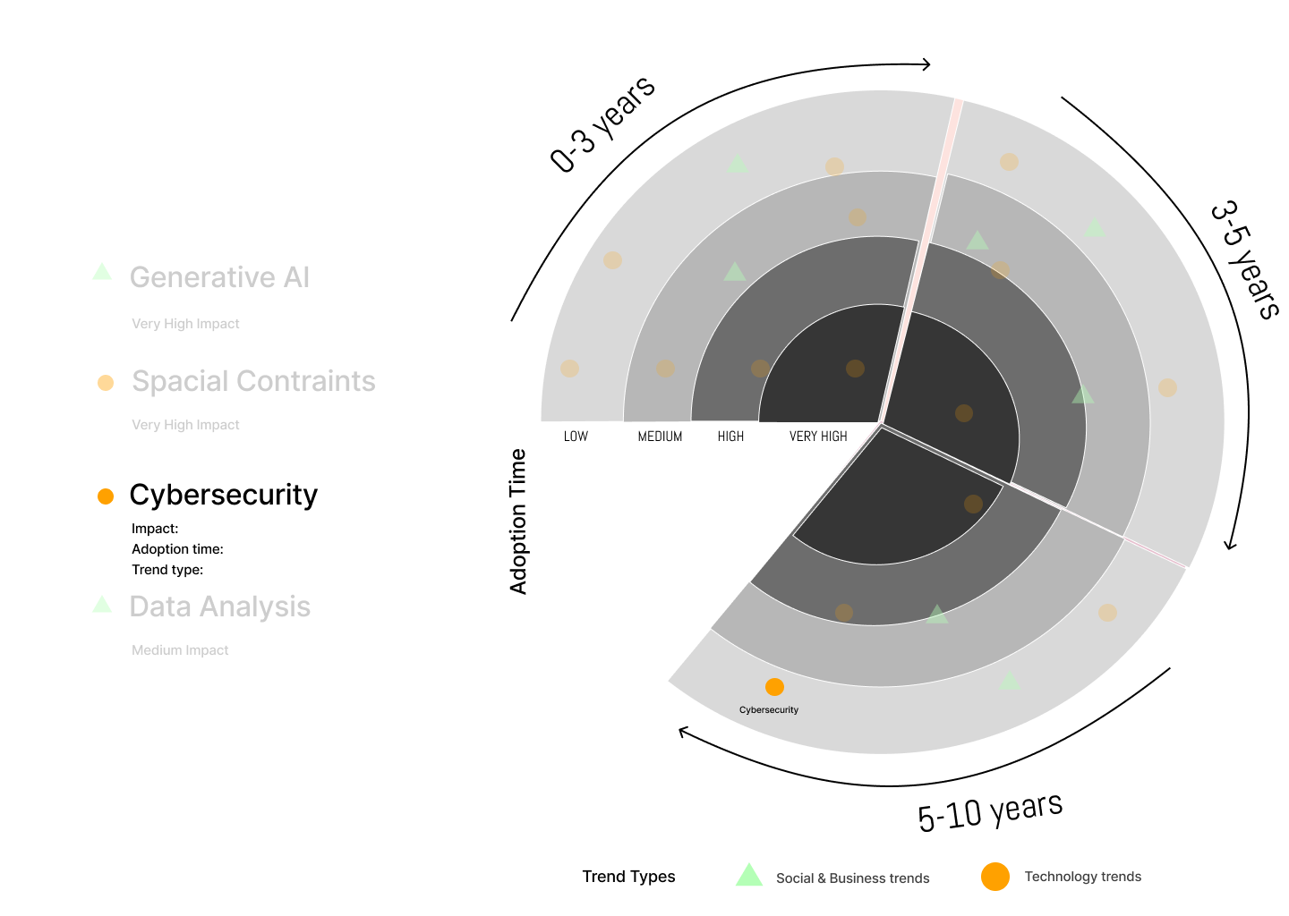
With research insights in hand, we began refining the radar step by step. The goal was to make each iteration more informative yet less visually overwhelming. We faded out inactive trends both on the radar and in the trend list to draw attention to the selected trend and to maintain a consistent sense of focus across all views. The addition of the word “Impact” clarified the meaning behind the inner-to-outer structure, helping users immediately understand the relationship between distance and significance.
We also refined the scrolling experience and overall composition, ensuring that every movement and highlight served a purpose. Color contrast and font hierarchy were optimized to maintain readability across large screens and compact devices. Each iteration represented an evolution in how we balanced data precision, visual rhythm, and brand personality — ultimately creating an experience that felt both analytical and engaging.
These design iterations formed a bridge between static information and interactive storytelling, where visual clarity and user intuition merged into a single coherent experience.
Inspiration
First Iteration
Second Iteration
Third Iteration
Phase 3
Web Version
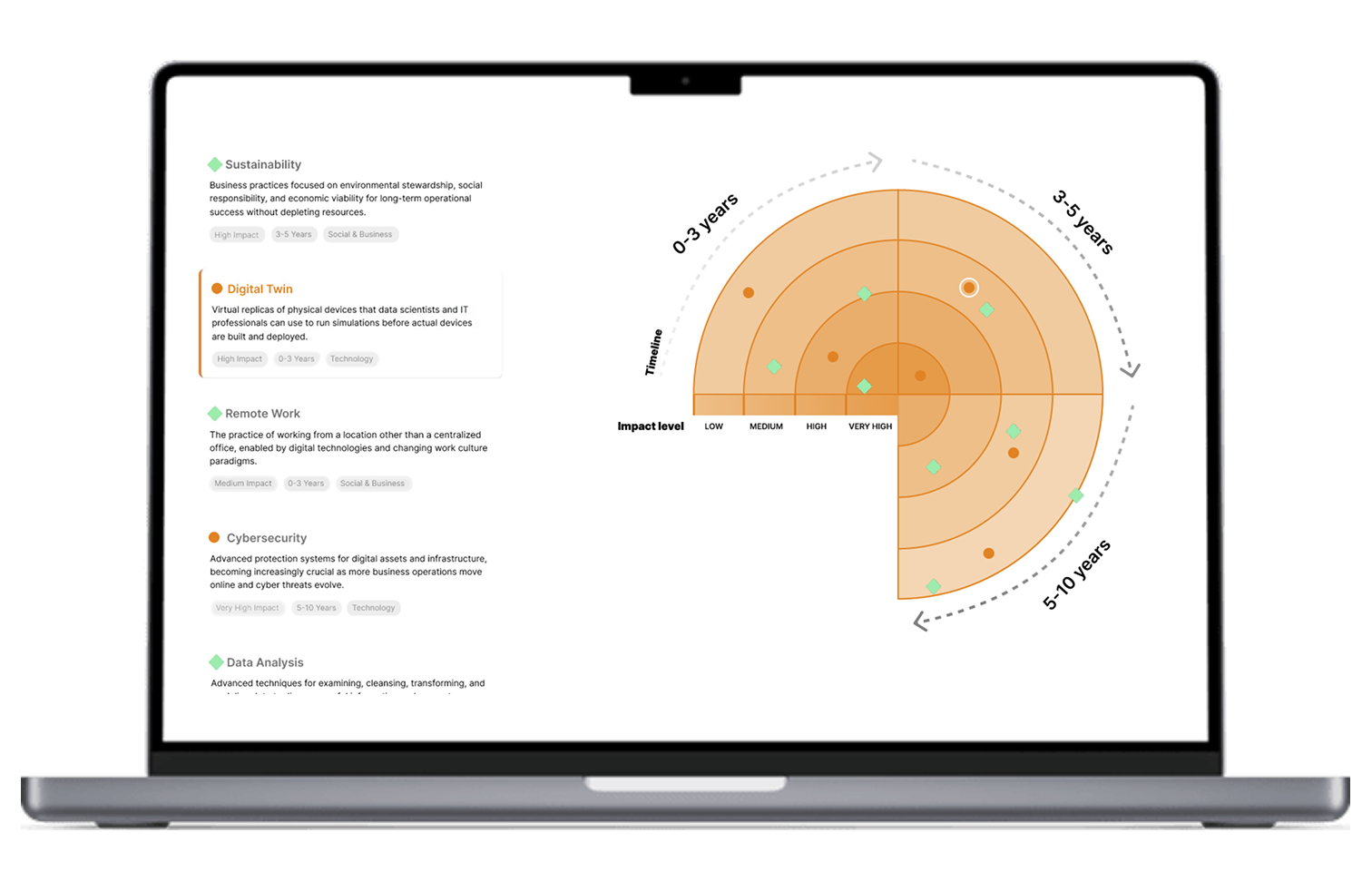
The web-based Trend Radar was developed to allow users to explore and understand complex trend data in an accessible and interactive way. The visualization dynamically adjusts to window size, providing a responsive experience across desktop and tablet devices. Built entirely with HTML, CSS and Vanilla JavaScript, it demonstrates how simple technologies can deliver a high-impact experience when combined with thoughtful information design.
Users can filter trends by impact, adoption level, or timeframe, and hover over elements to reveal additional context. Each interaction is designed to feel seamless and light, giving the radar a sense of motion and life. This version served as a foundation for exploring how web-based tools could enhance corporate innovation processes by making strategic insights more visually intuitive and easier to share across teams.
Phase 4
Mobile Version
The mobile application, developed in SwiftUI with MVVM architecture, translated the same logic and visual language to iOS. It preserved the interactivity of the web version while reimagining the layout for touch gestures and smaller screens. The app allows users to toggle between radar and list views, tap individual trends to access detailed descriptions, and filter results in real time through a clean and minimal interface.
Trends are loaded dynamically via REST API, while image assets are rendered asynchronously to keep performance smooth and responsive. Gesture-based interactions such as pinch-to-zoom and swipe navigation make exploring data intuitive and enjoyable. Together, the web and mobile versions demonstrate a cohesive ecosystem of design — adaptable, scalable, and consistent across platforms — where data visualization meets user-centered storytelling.